


 Coming soon: Get an early look at this upcoming feature
The Left Sidebar is a navigation component for signed-in users that gives learners quick access to important pages, menus, and actions from anywhere in your school.
Unlike the Topbar, the Left Sidebar appears only after users sign in and uses a single shared configuration across all the pages where it is enabled. You can choose where it appears, customize its layout and appearance, build navigation menus, and save your setup as a reusable template for future use.
In this article, we'll learn how to create, customize, and manage the Left Sidebar.
Use cases
Some common ways to use the left sidebar include:
- Give learners quick access to their Dashboard, Courses, and Calendar.
- Organize navigation into multiple menu groups.
- Add quick-access buttons, images, text, or other widgets.
- Display account actions such as Sign out or support information.
- Create different sidebar designs by using predefined templates.
Create a left sidebar
Follow these steps to add a left sidebar to your school:
1. From your admin dashboard, go to Website → Design → Edit website.
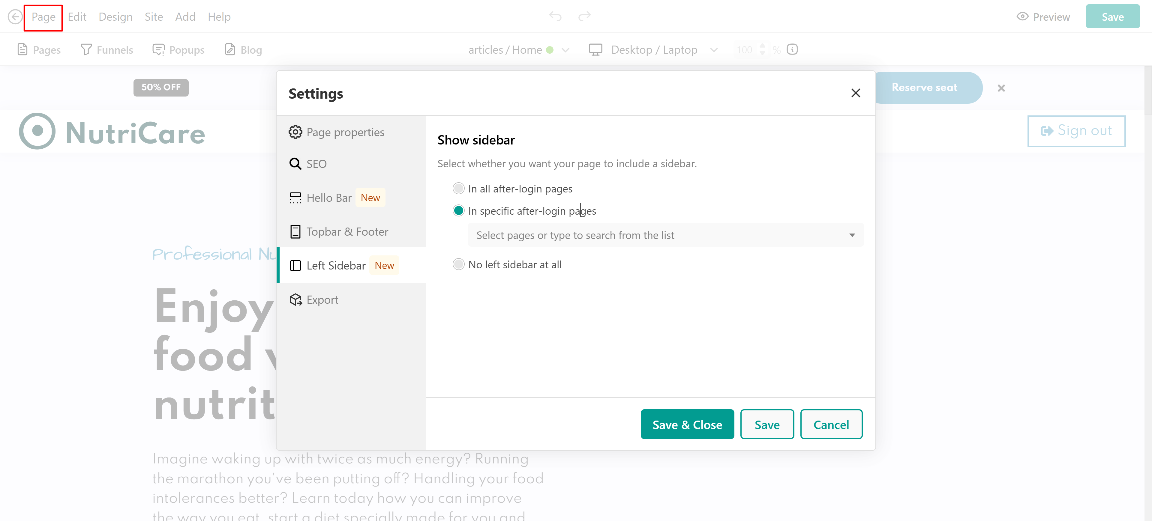
2. Open Page → Left sidebar. You can also select the sidebar directly from the page canvas if it is already available.
3. Choose where you want the sidebar to appear by selecting one of the following options:
- In all after-login pages
- In specific after-login pages
- No left sidebar
If you choose In specific after-login pages, select the pages where the sidebar should be displayed.
4. Choose a sidebar template or start with a blank configuration.
5. Click Save to apply your changes.
- The Left Sidebar is available only for signed-in users.
- One shared sidebar configuration is used across every page where it is enabled.
- Changes you make are automatically applied everywhere the sidebar is displayed.
Left sidebar structure
The Left Sidebar consists of three fixed sections, and their order cannot be changed.
Top section
The top section uses predefined layouts to display user and branding information. Depending on the selected layout, it can include:
- User avatar
- User name
- School logo
- User actions
- Close button
The top section uses predefined layouts and does not support widgets from the Site Builder widget library.Main section
The main section is the primary content area of the sidebar. Here you can:
- Add and remove widgets.
- Edit menu.
- Rearrange widgets using drag and drop.
- Configure layout and appearance.
- Apply visibility settings.
Bottom section
The bottom section contains predefined account-related layouts. Depending on the selected layout, it can include:
- Sign out
- User information
- Support contact
- Other account-related actions
Like the top section, the bottom section uses predefined layouts rather than widgets from the widget library. It always remains positioned at the bottom of the sidebar.
Create your navigation menu
The Main section of the Left Sidebar can include navigation menus and other widgets. Navigation menus contain the links visitors use to move around your website.
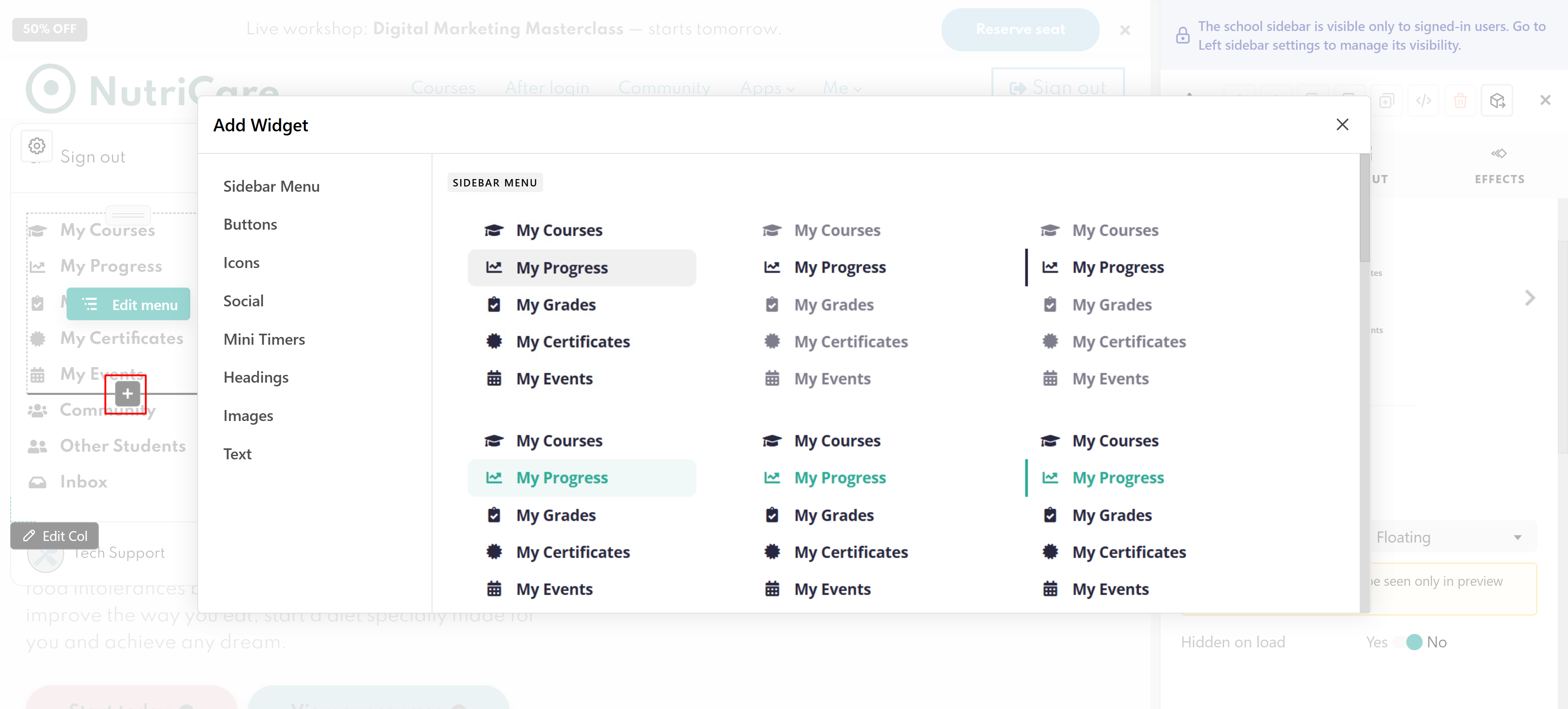
To edit an existing menu, select the Sidebar Menu widget and click Edit menu. To add a new menu:
1. Click the plus (+) icon in the Main section.
2. Select Sidebar Menu.
In the navigation editor, select the menu you want to update. From the panel on the left, you can customize its appearance and add menu items. You can add:
- Predefined links
- Custom links
- Spacers
- Dividers
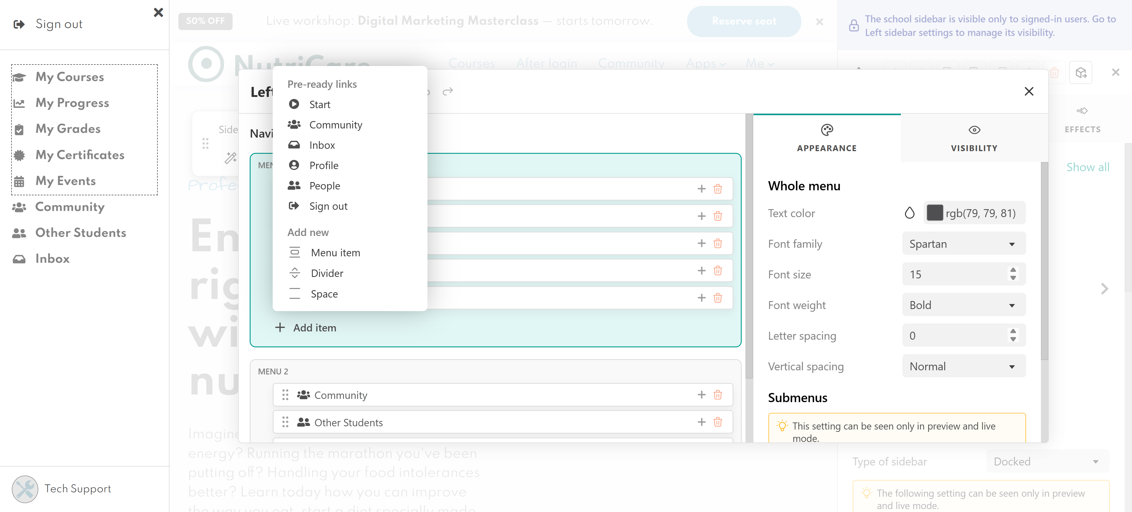
Spacers and dividers help you organize menu items and make longer menus easier to read.
To choose where a menu item directs visitors, select the item. Then, from the settings panel on the right, go to Menu item and configure its On click action.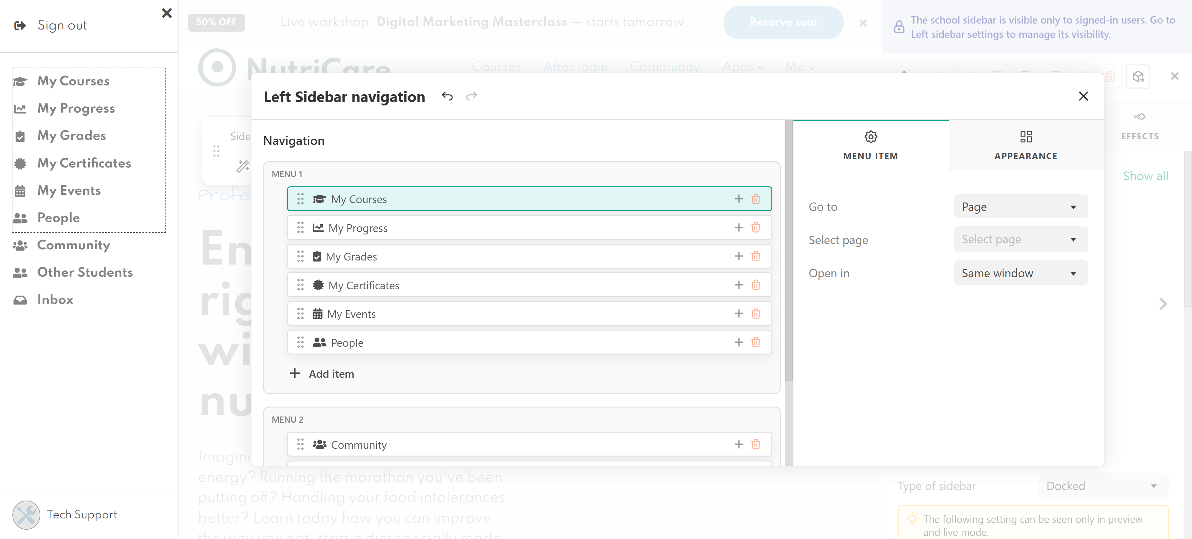
Add additional widgets
The Main section isn't limited to navigation menus. You can also add widgets, including:
- Buttons
- Images
- Text
- Icons
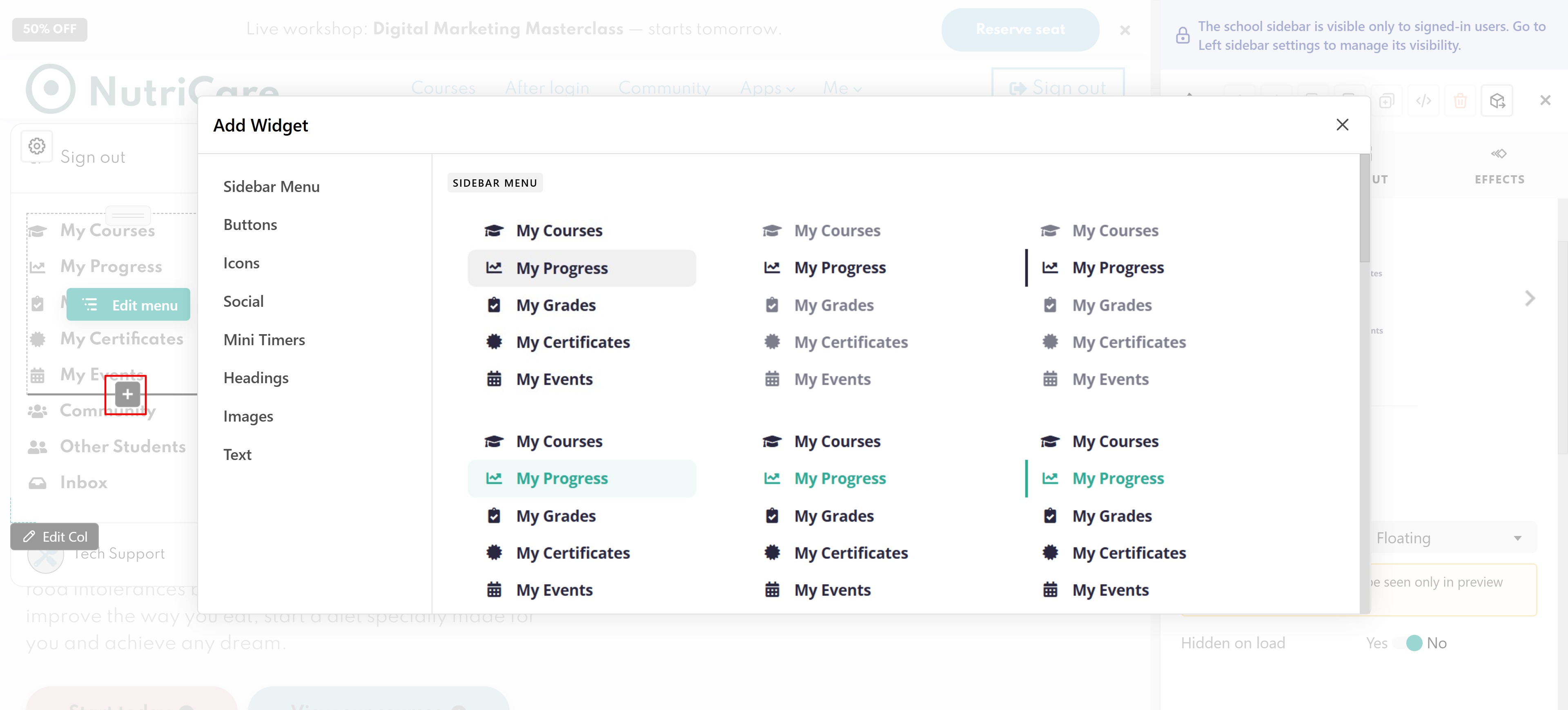
This allows you to combine navigation with promotional content, announcements, shortcuts, or other interactive elements.
Customize the sidebar layout and appearance
While editing the sideform you can also choose a sidebar type, it can be"
- Docked: The sidebar stays attached to the left side of the page and reduces the available page width. This option works well for schools that want navigation to remain visible at all times.
- Overlay: The sidebar opens on top of the page content without changing the page layout. This provides quick access to navigation while keeping the page content unchanged.
- Floating: The sidebar appears as a floating panel above the page content.
Use sidebar templates
If you don't want to build a sidebar from scratch, you can start from one of the predefined templates. Click Show all in the Layout section to open the template gallery.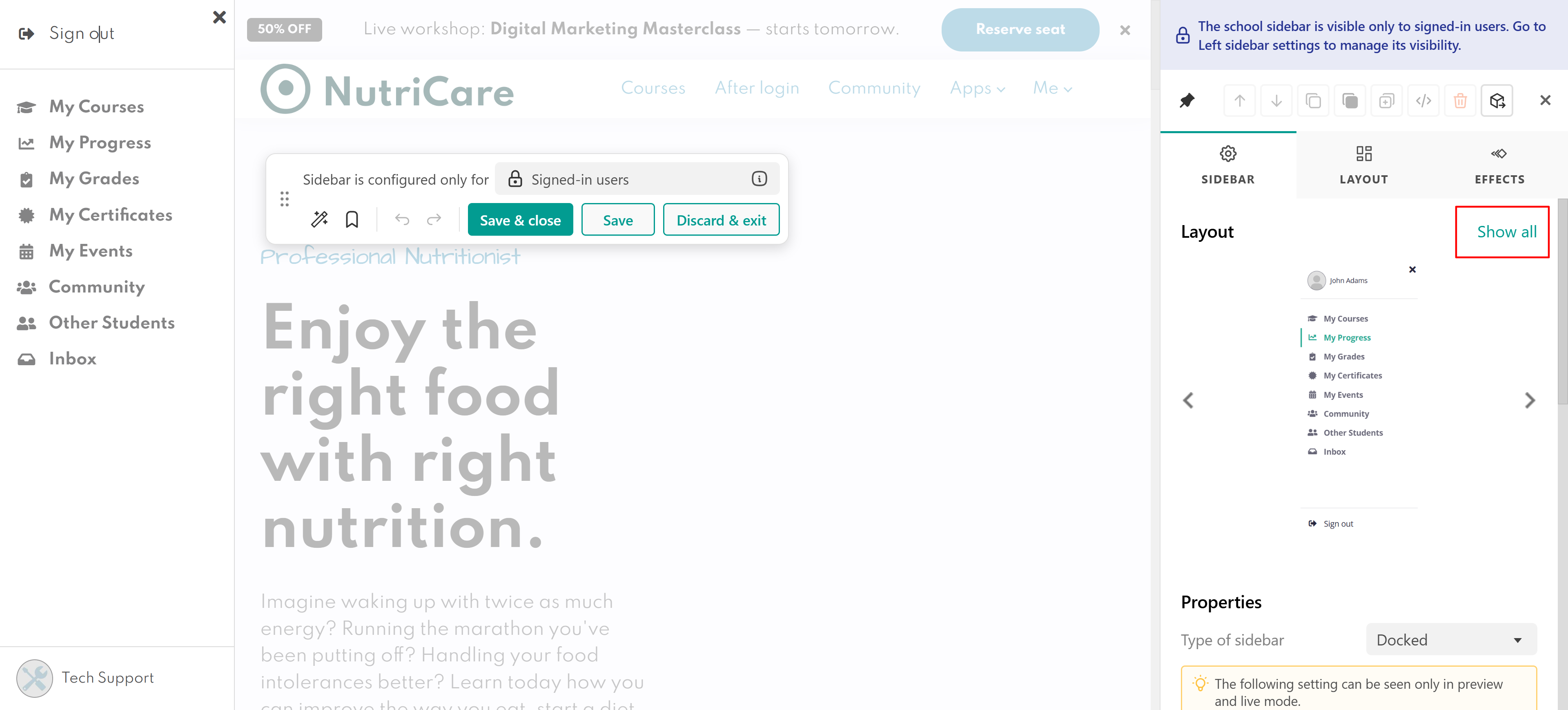
After applying a template, you can continue customizing every supported setting. Changing only the top or bottom layout does not affect the widgets you've added to the main section.
Save and reuse a sidebar
Once you've finished building your sidebar, you can save it as a reusable template. Click Save Sidebar, give your template a name and save it.
Your sidebar is now saved under Saved Sidebars.
You can apply a saved sidebar at any time and continue editing it after it has been applied.
Best practices
- Keep your navigation simple and group related pages together.
- Use clear labels so learners can quickly find what they need.
- Limit the number of menu items to avoid overwhelming users.
- Preview the sidebar on different devices before publishing.
- Save frequently used sidebar designs as reusable templates to maintain consistency across your school.